Introduction
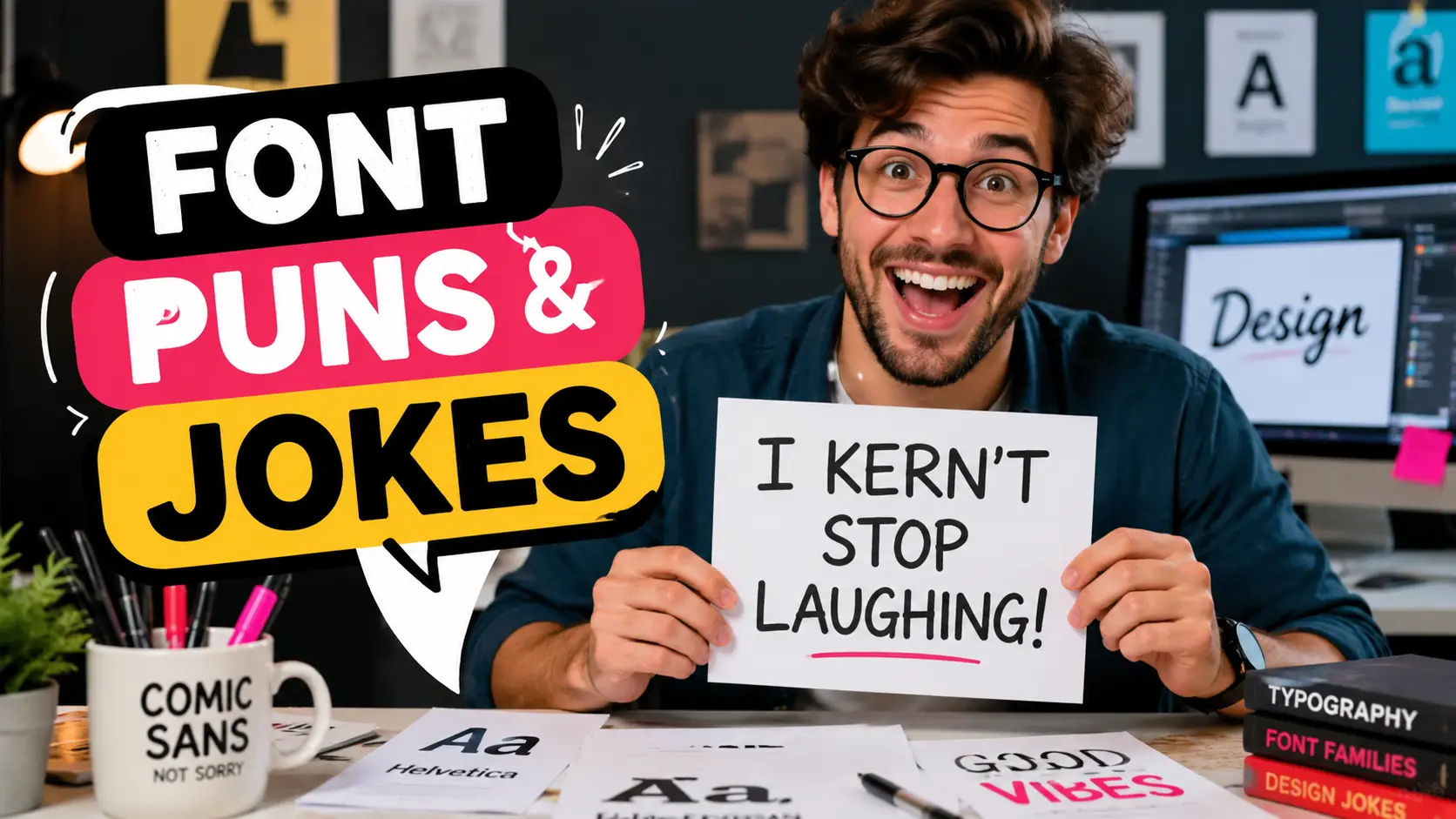
Fonts do more than make words readable. They give text personality, mood, attitude, and sometimes accidental comedy. That is why Font Puns And Jokes are perfect for designers, teachers, students, office workers, social media captions, and anyone who enjoys clever wordplay.
This collection is built to be clean, modern, easy to share, and actually useful. You will find quick one-liners, dad jokes, Comic Sans jokes, typography puns, kerning jokes, caption ideas, workplace jokes, school jokes, and even a few nerdy lines for people who know their glyphs from their ligatures.
Use them in posts, presentations, group chats, classroom boards, design meetings, birthday cards, or whenever the conversation needs a little bold formatting.
Quick Font Puns and One-Liners
Need a fast joke that lands without a long setup? These short font puns are perfect for captions, texts, bios, and quick laughs when you want the humor to be sharp, clean, and easy to copy.
- I tried to write a serious sentence, but the font had other characters.
- My favorite font is always there when I need support – it has great type strength.
- I do not argue with fonts; they always make their point.
- That font was too dramatic, so I told it to lower its case.
- I asked my font for advice, and it gave me character development.
- Fonts never panic during pressure; they just stay composed.
- I told my text to calm down, and it became regular.
- The font joined the gym because it wanted stronger strokes.
- My paragraph got promoted because it had excellent alignment.
- Fonts make great friends because they always show their true type.
- The alphabet opened a business, but the fonts handled the branding.
- I complimented my font, and it became extra bold.
- The letters started a band because they had perfect spacing.
- My document is not lazy; it is just in restyled mode.
- The font got invited to every party because it had great character.
Clean Dad Font Jokes
These are the kind of jokes that make people groan, laugh, and immediately send them to a group chat. They are clean, family-friendly, and perfect for dad joke fans who love harmless wordplay.
- Why did the font bring a ladder? It wanted to reach a higher case.
- Why was the font so polite? It always minded its type manners.
- Why did the letter go to school? To improve its character.
- Why did the paragraph get a job? It had strong references.
- Why did the font sit near the window? It wanted better spacing.
- Why did the designer trust the font? It was very reliable in print.
- Why did the bold font win the debate? It made the strongest point.
- Why did the lowercase letter feel relaxed? It was not under capital pressure.
- Why did the font go on vacation? It needed a break from being read all day.
- Why did the text refuse to run? It was already in a good line.
- Why did the font open a bakery? It knew how to make perfect rolls of text.
- Why did the letters start exercising? They wanted better form.
- Why did the sentence feel confident? It had excellent punctuation support.
- Why did the font become a teacher? It loved shaping young characters.
- Why did the headline get applause? It knew how to make a bold entrance.
Typography Puns for Designers
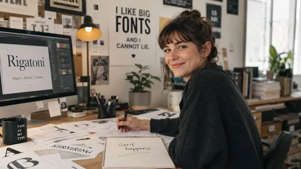
Designers know that typography is not “just picking a font.” It is spacing, weight, contrast, hierarchy, and trying not to cry when a client asks for “something more premium but also playful.” These jokes are made for creative people who live in layout mode.
- My designer friend does not hold grudges; she just adjusts the tracking and moves on.
- A good layout is like a good joke: timing, spacing, and one clean punchline.
- I asked the designer for balance, and they opened a typography panel.
- Designers do not gossip; they discuss character issues.
- My type hierarchy is healthier than my sleep schedule.
- I trust designers because they know when to give things space.
- A bad font choice can turn a luxury brand into a garage sale flyer.
- Designers see kerning problems the way detectives see footprints.
- I tried to relax, but the uneven baseline found me.
- Typography is just architecture for letters with better coffee.
- Designers do not overthink; they simply notice 47 invisible problems.
- My font pairing worked so well that even the pixels clapped.
- I asked for a quick design fix, and the designer quietly aged five years.
- Good typography whispers; bad typography uses a megaphone in Comic Sans.
- The designer said the text needed breathing room, so I sent it to a spa.
Comic Sans Jokes
Comic Sans is probably the most famous funny font on the internet. People love it, hate it, defend it, roast it, and still somehow use it on signs. These jokes keep the roasting clean and playful.
- Comic Sans does not enter a room; it bounces in with unnecessary confidence.
- I used Comic Sans for my résumé, and the printer asked if I was joking.
- Comic Sans is what happens when letters discover sugar.
- My design looked professional until Comic Sans showed up wearing party shoes.
- Comic Sans never whispers; it giggles in full volume.
- The meeting was serious until someone opened the slide deck in Comic Sans.
- Comic Sans has the energy of a birthday invitation that became a legal document.
- I asked Comic Sans to be subtle, and it arrived with balloons.
- Comic Sans is not a font; it is a mood swing with curves.
- My logo wanted elegance, but Comic Sans brought snacks.
- Comic Sans joined the group project and immediately changed the vibe.
- Even my spellcheck paused when it saw Comic Sans in the contract.
- Comic Sans is the friend who says, “Trust me,” right before chaos.
- The font menu has many choices, yet Comic Sans always waves the loudest.
- Comic Sans is proof that confidence can survive any critique.
Helvetica, Arial, and Minimalist Font Jokes
Helvetica And Arial are the clean-shirt, neat-desk, black-coffee fonts of the design world. They are simple, dependable, and always ready to look professional without causing drama.
- Helvetica does not chase attention; attention aligns itself around Helvetica.
- Arial walked into the meeting and said, “I can do what Helvetica does, but cheaper.”
- Helvetica is the font equivalent of a perfectly folded white shirt.
- Arial never brags; it just appears in every document quietly doing the work.
- Helvetica makes even a grocery list look like a brand strategy.
- Arial is not boring; it is just emotionally available in Microsoft Word.
- Helvetica does not need filters. It was born clean.
- Arial and Helvetica went to a party, and everyone asked if they were related.
- Helvetica’s toxic trait is making simplicity look expensive.
- Arial’s superpower is being everywhere and still acting casual.
- Helvetica does not shout. It uses premium silence.
- Arial said, “I may not be fancy, but I have opened more documents than you.”
- Helvetica is what minimalism wears to a job interview.
- Arial is the reliable friend who always brings the charger.
- Helvetica and Arial are proof that fonts can have a quiet rivalry.
Serif and Sans Serif Puns
Serif fonts have little finishing strokes, while sans serif fonts keep things clean and simple. That tiny difference creates a big personality gap, which makes them perfect for jokes.
- Serif fonts dress like they own a library.
- Sans serif fonts show up clean, modern, and suspiciously organized.
- Serif said, “I bring tradition.” Sans serif said, “I bring Wi-Fi.”
- A serif font writes thank-you notes by hand.
- A sans serif font sends calendar invites with perfect formatting.
- Serif fonts do not walk; they make an entrance with tiny shoes.
- Sans serif fonts are allergic to extra decoration.
- Serif brought history to the party; sans serif brought a startup pitch.
- Serif fonts look like they know which fork to use at dinner.
- Sans serif fonts look like they drink cold brew and optimize workflows.
- Serif said, “Respect the classics.” Sans serif said, “Respect the whitespace.”
- A serif font can make a menu feel like fine dining.
- A sans serif font can make a tax form feel almost friendly.
- Serif and sans serif broke up because one wanted details and the other wanted space.
- Serif fonts add flair; sans-serif fonts remove the flair and call it strategy.
Kerning, Leading, and Spacing Jokes
Kerning, leading, and tracking are the secret rhythm section of typography. Most people do not notice them when they are right, but everyone feels the awkwardness when they are wrong.
- I fixed the kerning, and suddenly the word stopped looking like it needed counseling.
- Bad spacing is just letters standing too close on public transport.
- Kerning is relationship therapy for awkward letter pairs.
- Leading is proof that even lines need personal space.
- Tracking told kerning, “Relax, I handle the whole group.”
- The letters argued until kerning stepped in and created boundaries.
- My text looked anxious, so I gave it more leading.
- Good spacing is invisible; bad spacing becomes the main character.
- Kerning problems are tiny gaps with huge confidence.
- The word looked suspicious until the designer adjusted the spacing.
- I do not fear deadlines; I fear uneven letter spacing.
- Leading makes paragraphs breathe like they just finished yoga.
- The designer zoomed in at 400 percent and called it “normal behavior.”
- Tracking is what happens when the whole alphabet needs room.
- Kerning is small, but it can ruin a logo with big energy.
Bold, Italic, and Underline Jokes
Bold, italic, and underline are the drama tools of text formatting. They help words shout, lean, emphasize, and sometimes act like they are the star of the sentence.
- Bold text does not ask for attention; it invoices for it.
- Italic text always looks like it is late for something.
- Underline is the friend who says, “This part matters,” five times.
- Bold walked into the room, and the sentence stood up straighter.
- Italic joined the conversation and immediately leaned into the gossip.
- Underline does not trust people to notice things naturally.
- Bold has main character energy in every paragraph.
- Italic is just regular text doing a dramatic side pose.
- Underline is the highlighter’s more serious cousin.
- Bold text never whispers unless the font size is tiny.
- Italic makes even boring words look like they know secrets.
- Underline wanted commitment, so the sentence drew a line.
- Bold and italic walked into a document and turned it into a headline.
- My text became bold after one motivational podcast.
- Italic text is proof that confidence can lean without falling.
Times New Roman and Classic Font Jokes
Classic fonts bring school essays, old documents, formal letters, and office nostalgia. They are dependable, familiar, and ready to make anything look like it has a deadline.
- Times New Roman smells like homework and printer ink.
- I used Times New Roman, and my essay immediately asked for a bibliography.
- Georgia arrived with charm, manners, and a perfectly formatted invitation.
- Garamond does not rush; it has been elegant for centuries.
- Courier New types like it still owns a fax machine.
- Times New Roman makes a casual note feel like a court statement.
- My document changed to Times New Roman and suddenly needed footnotes.
- Georgia is Times New Roman after a weekend at a nice hotel.
- Courier New is the font equivalent of a detective file.
- Garamond speaks softly but owns every bookshelf.
- Times New Roman has never missed a school deadline in its life.
- Courier New looks like it knows a password from 1998.
- Georgia makes websites feel polite.
- Times New Roman is what essays wear to graduation.
- Classic fonts never go viral; they just stay employed forever.
Graphic Design and Canva Font Jokes
From logo drafts to Canva templates, font choices can make or break a design. These jokes are for anyone who has ever moved text boxes around for “just five more minutes” and somehow lost an hour.
- Canva said “easy design,” and my font choices said “emotional journey.”
- My logo looked expensive until I tried twelve fonts and trusted none of them.
- Graphic design is 10% creativity and 90% asking, “Why does this font feel wrong?”
- I opened Canva for one post and left with a full brand identity crisis.
- The client asked for “modern but timeless,” so the fonts formed a support group.
- My design was almost done, then I discovered another font pairing.
- Canva templates are calm until you start moving things one pixel at a time.
- A font can turn “Sale Today” into either luxury retail or school fair.
- My logo did not fail; it just chose the wrong type personality.
- The designer picked a font so clean that the headline started paying rent.
- I made a quick social post, then spent 40 minutes choosing between two nearly identical fonts.
- Font pairing is dating, but with more judgment and fewer dinner plans.
- My design brief said “simple,” but my font folder heard “audition.”
- Canva gave me options, and I gave myself confusion.
- The right font makes a brand speak; the wrong font makes it mumble.
Funny Font Captions for Instagram and TikTok
Short, punchy, and screenshot-ready — these font captions work well for design posts, memes, reels, carousels, and creative mood updates. Use them when your post needs a little typography personality.
- Currently in my clean layout era.
- This mood is bold, but emotionally kerned.
- Some people have red flags. I notice bad fonts.
- New font, same overthinking.
- Main character energy, set in medium weight.
- My personality has too many alternate characters.
- Romanticizing life, one font pairing at a time.
- This is not a phase; it is a type system.
- Sorry, I cannot come. I am adjusting spacing.
- Less drama, more baseline alignment.
- If the caption looks good, thank the font.
- Today’s vibe: soft serif, strong coffee.
- My toxic trait is judging menus by typography.
- Just a designer trying to keep the pixels peaceful.
- Good fonts, good mood, questionable deadline.
Office, Presentation, and Email Font Jokes
Font choices show up everywhere at work: emails, reports, slide decks, proposals, and presentations. These jokes Are Clean enough for office use and funny enough for the group chat after the meeting.
- I changed the proposal font, and suddenly it sounded more expensive.
- The PowerPoint was fine until slide seven chose chaos.
- My email looked polite after I removed the accidental bold.
- Office fonts know more company secrets than the interns.
- A good presentation font says, “I prepared.” A bad one says, “I clicked randomly.”
- The report was late, but at least the heading hierarchy was emotionally stable.
- My boss asked for clarity, so I increased the font size and took credit.
- The meeting could have been an email, but the email needed better typography.
- I trust a coworker who aligns text properly.
- The spreadsheet used Calibri and said, “I am here to survive the quarter.”
- The company memo changed fonts and suddenly sounded less angry.
- I made the slide title bold because confidence is half the presentation.
- The office printer judged my font choice before my manager did.
- My agenda looked professional until someone added rainbow WordArt energy.
- Work-life balance is finding a font that says “urgent” without screaming.
School, Student, and Teacher Font Jokes
Students and teachers know the power of fonts: essays, projects, posters, worksheets, presentations, and the classic moment when someone tries to stretch a paper with font size. These are classroom-safe and easy to share.
- I changed my essay to a larger font and called it academic growth.
- Times New Roman has carried more students than school buses.
- The teacher said, “Use a readable font,” and Comic Sans felt personally attacked.
- My project looked smarter after I fixed the headings.
- The font size went from 12 to 13, and my essay gained confidence.
- Students do not procrastinate; they wait for the perfect font.
- My bibliography used proper formatting and started acting superior.
- The classroom poster chose a font so loud it got detention.
- The teacher knew the assignment was rushed when the title had three fonts.
- My notes are messy, but the headings are trying their best.
- Font choice is the first group project argument.
- The essay did not need more words; it needed better line spacing.
- The presentation font was so tiny even the front row needed binoculars.
- My worksheet looked friendly after the font stopped yelling.
- The student used a fancy font and accidentally summoned a medieval essay.
Font Family and Relationship Jokes
Fonts have families, weights, styles, and personalities, so they are perfect for relationship-style jokes. These are clean, playful, and great for greeting cards, captions, and lighthearted posts.
- My font family is complicated, but at least everyone is aligned.
- The bold font was the confident sibling.
- The light font was quiet but still part of the family.
- The italic cousin always leaned into family drama.
- The condensed font hated crowded reunions for obvious reasons.
- The extended font needed extra space at the dinner table.
- The font family photo looked perfect after everyone adjusted their baseline.
- Regular font was tired of being called “the normal one.”
- The black weight font showed up and made the whole family nervous.
- The thin font said, “I am delicate, not weak.”
- The rounded font was everyone’s friendly uncle.
- The script font arrived late but beautifully.
- The display font wanted attention at every family event.
- The monospace cousin gave everyone equal room and zero favoritism.
- The font family argued, but the type system kept them together.
Nerdy Typography Jokes: Glyphs, Ligatures, Baselines, and More
This section is for typography lovers who enjoy the little details most people never notice. If words like glyph, ligature, x-height, baseline, and descender make you smile, these jokes are for you.
- My glyphs are not weird; they are artistically misunderstood.
- The ligature said, “Why be separate when we can be stylish together?”
- My baseline is more stable than my weekend plans.
- The descender felt down, but that was literally its job.
- The ascender always had high expectations.
- X-height is small but somehow controls the whole vibe.
- The counter in the letter “o” said, “I may be empty, but I have purpose.”
- The bowl of the letter “a” joined a cooking class by mistake.
- The stem held the letter together during tough times.
- The terminal ended the stroke and said, “That is where I leave.”
- The aperture was open-minded about typography.
- The crossbar carried the letter like a tiny bridge.
- The serif called itself a detail; the sans serif called it clutter.
- The glyph walked into the font file and said, “I am more than a character.”
- The baseline told the letters, “Everyone, please stay grounded.”
People Also Ask
Font puns and jokes are funny lines based on fonts, typefaces, typography terms, and design language. They often use double meanings from words like bold, italic, character, spacing, serif, and type.
Yes. Font jokes work well as social media captions because they are short, clever, and easy to understand. They are especially useful for designers, creative agencies, meme pages, teachers, and anyone posting typography or design content.
Comic Sans is one of the most joked-about fonts because it has a playful look and a strong reputation in internet humor. Helvetica, Arial, Times New Roman, and Courier New are also popular in font jokes.
Yes. This collection is written to be clean, family-friendly, office-friendly, school-friendly, and safe for general audiences.
Typography jokes are popular with graphic designers, web designers, teachers, students, marketers, social media managers, writers, and anyone who enjoys clever wordplay.
Yes. Use short, clean jokes from the office, school, Helvetica, or typography sections as icebreakers in presentations, design classes, creative workshops, or team meetings.
A good font pun is short, clear, and built around a double meaning. The best ones connect a typography term to a real-life situation, like confidence, relationships, school, office work, or social media.
Conclusion
Font Puns And Jokes are a perfect mix of clean comedy, clever wordplay, and creative personality. They work because fonts are everywhere: in school projects, office slides, social media posts, logos, websites, memes, and everyday messages.
Whether you are a designer judging kerning from across the room, a teacher making a classroom board more fun, or a dad joke fan who simply loves a groan-worthy punchline, this list gives you plenty of bold, italic, serif, sans-serif, and Comic Sans-worthy humor to share.
Bookmark this page, send your favorite joke to a friend, or use one as your next caption. Good typography deserves good comedy too.